Understanding Graphic Design Colour Modes and Methods
When you’re not a designer, wrapping your head around the modes of graphic design colours and deciding which printing method is best to use can get overwhelming. All of those acronyms become confusing. And it will require a keen eye to tell the difference between colour palettes.
So we’ve put together a beginner-friendly guide to help you navigate the exciting world of colours!
CMYK
CMYK stands for cyan, magenta, yellow, and black. These four base colours are used in different quantities and combinations to create a series of colours seen in print.
This colour mode is created by adding colour to a white page to make the page darker. When certain combinations of these colours are mixed, red, green, yellow, and a variety of other shades are produced.
This is often the standard colour mode used in inkjet-based home and office printers as well as larger industrial printers. When using the CMYK colour mode on an industrial printer, each shade is added to the page one at a time and layered over one another to create a full spectrum of colours in the image.
RGB
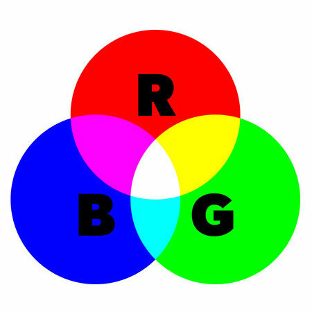
RGB stands for red, green, and blue. They are the three primary colours that make up the colour mode used on screens and digital devices. The various combinations of these colours can create a more expansive range of shades than the CMYK mode.
The process of RGB colouring is the opposite to that of CMYK. The colours are added to a black page (or screen) to add coloured light to an image.
Most images seen on a screen use the RGB colour mode. However, when we print, the colours are created based on the CMYK colour mode. This means the image you see on your screen may look quite different when it comes out on paper.
It is possible to convert the colour mode of your image from RGB to CMYK and vice versa, but this may result in unexpected colours when your prints return. The best way to avoid this is by creating your image in the correct colour mode from the start.
However, due to the changing surface on which you’re viewing these colours, a screen and then a piece of paper, the hues will never exactly match.
Pantone
Unlike CMYK and RGB, Pantone Matching System is a numbered system where the precise colour you’re using has a specific number that can be matched by any printer equipped to print Pantone.
Rather than layering primary colours to create secondary colours, Pantone offers a wide range of colour swatches that can be accurately replicated again and again.
The method for Pantone printing is called spot printing. Similar to CMYK printing, spot printing is done one colour at a time. However in this case, the colours don’t need to be mixed or layered, as the exact shade of ink has already been specifically blended and programmed for your printing needs.
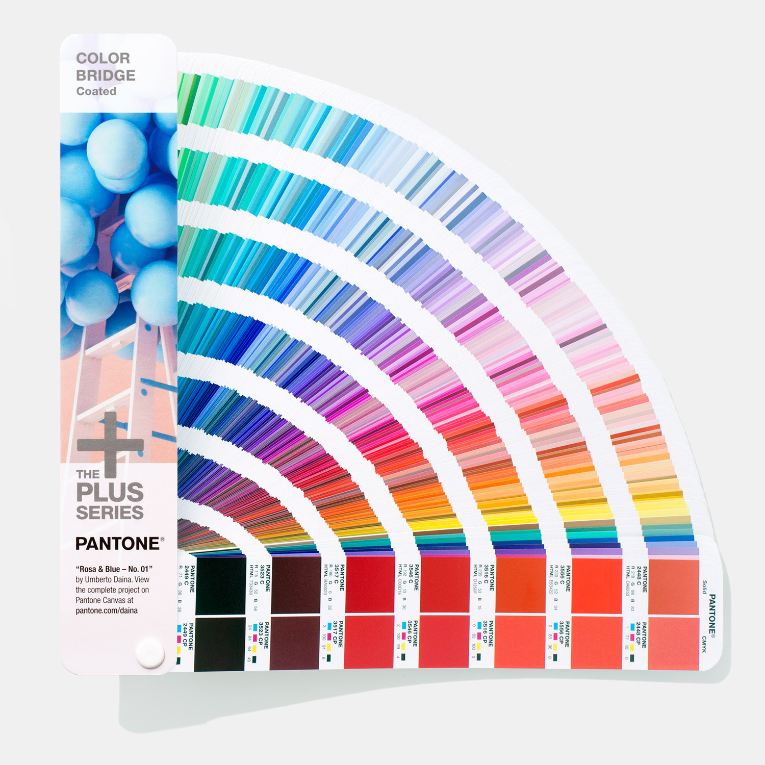
The best way to view the variety of Pantone colours available is from a Pantone Colour Swatch Book. The only way to see a true pantone colour is on paper, as every screen will show the shades differently.
So, which colour mode is best?
Pantone Matching System is a much more accurate and consistent colour mode. The variety of colours is far greater than that of CMYK. However, because of the need to program each print specifically to the colour palette of the design, the Pantone system would cost more than a standard CMYK print, especially in small batches.
CMYK prints are cheaper and recommended when the exact colouring of a printed document isn’t a concern. Also, unlike CMYK, the RGB colour mode can not be automatically converted to a Pantone mode. The colours have to be hand-selected to best match your image as it’s converted from the screen to the page.
Overall, the best type of colour mode depends on the printing job. When printing images for your brand, a unique and precise colour palette (created through Pantone) that’s consistent across all of your marketing and collateral media is worth the investment.
If you have questions about graphic design colour modes, feel free to contact us.


