Product Packaging for Organic B Leaf
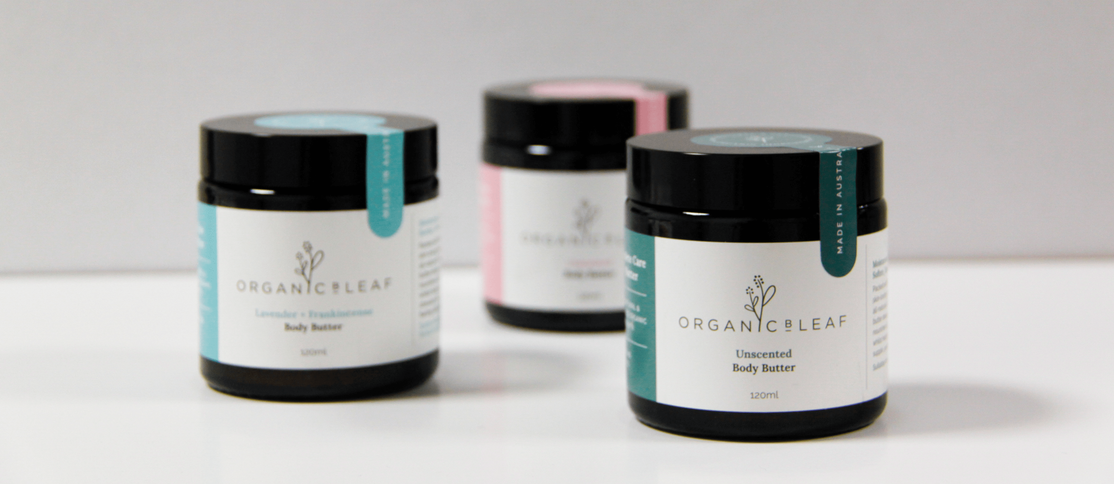
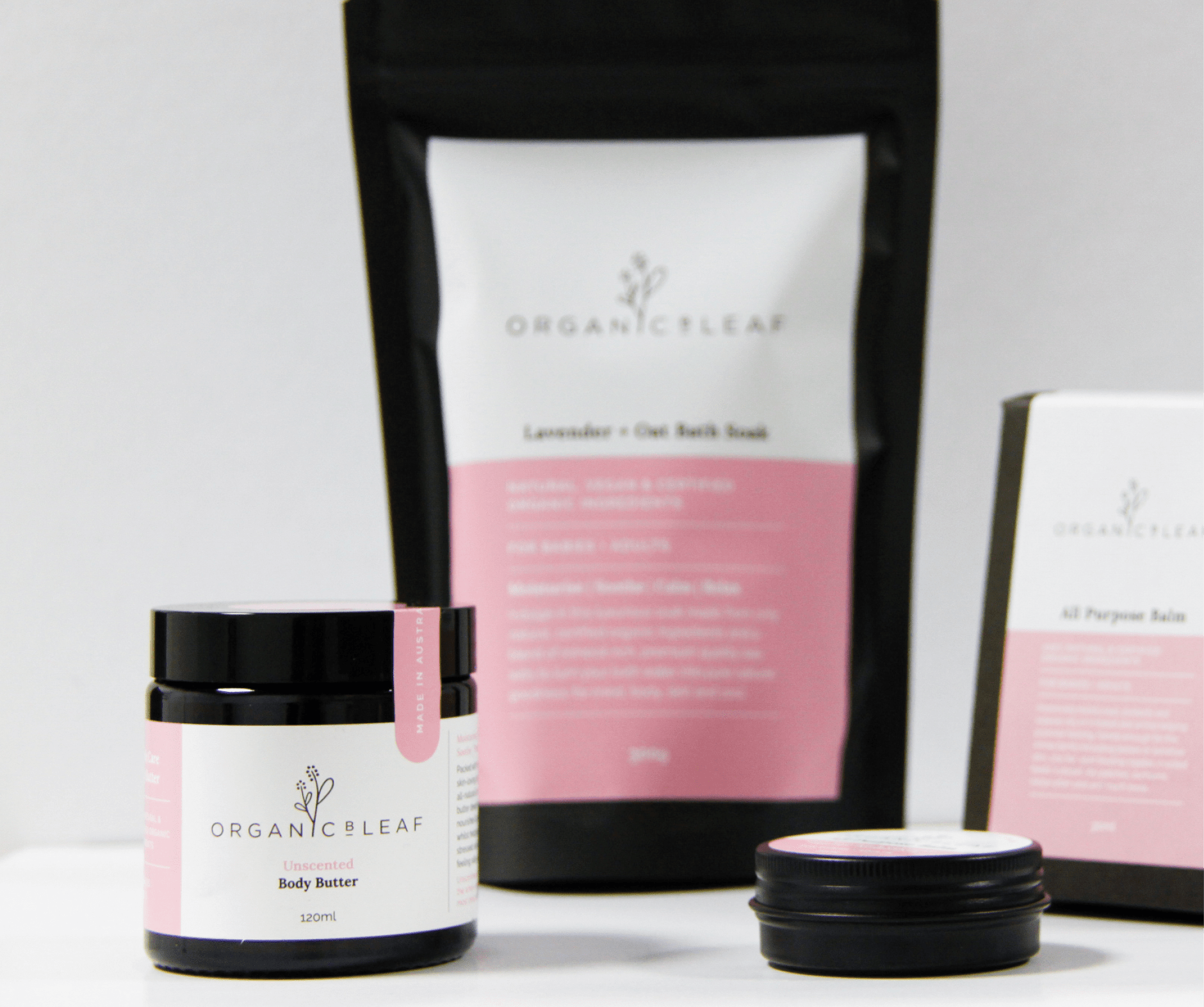
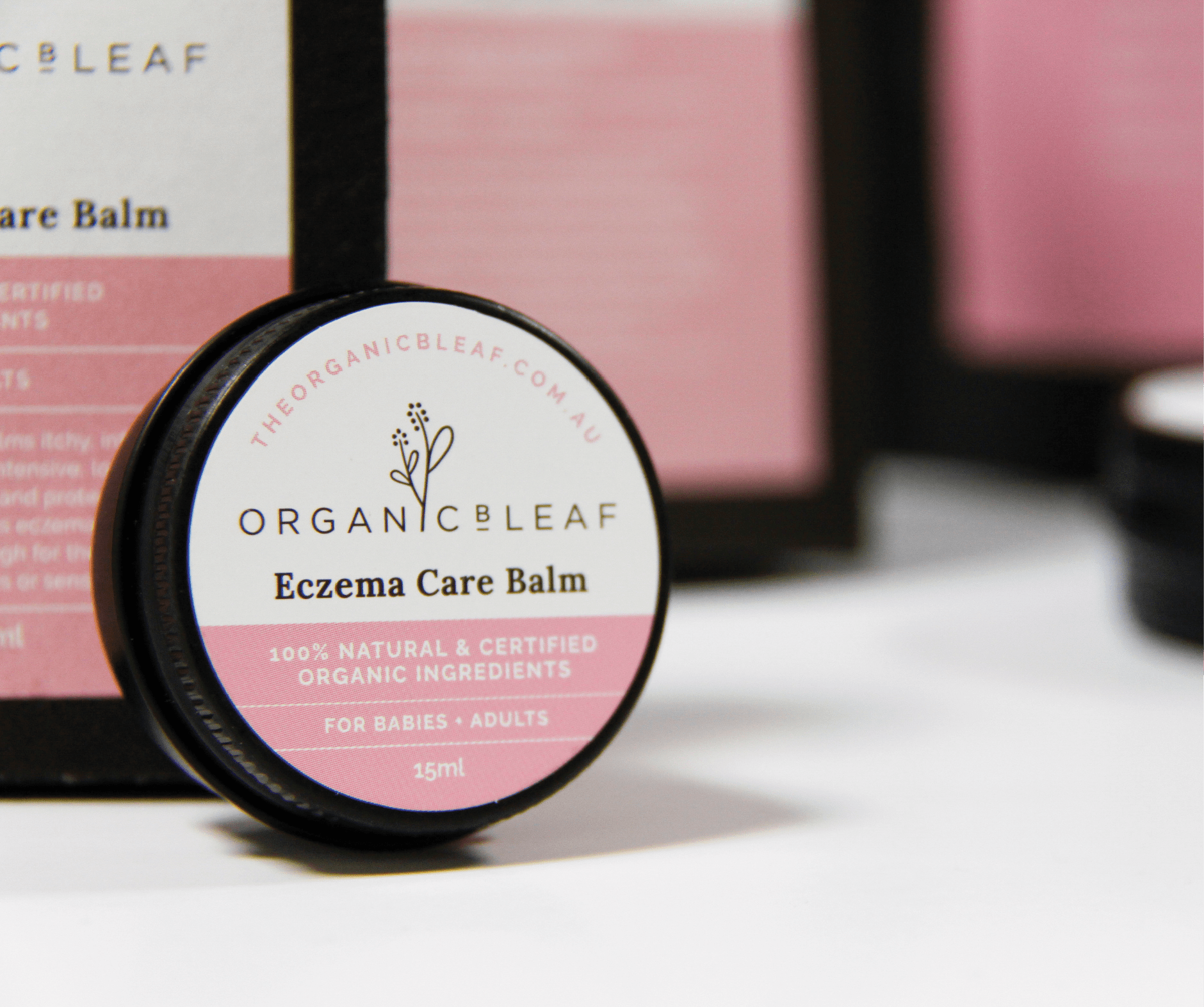
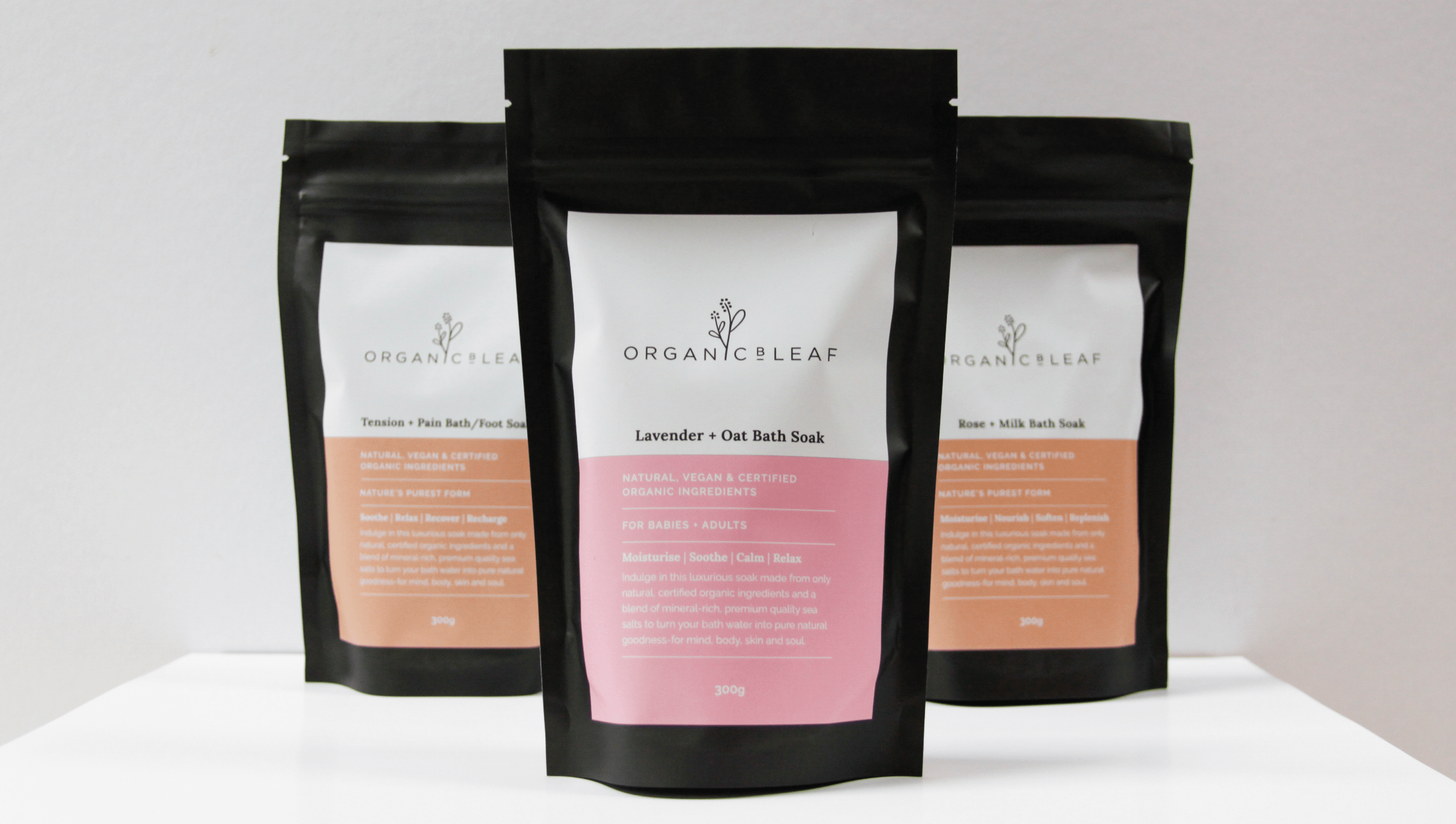
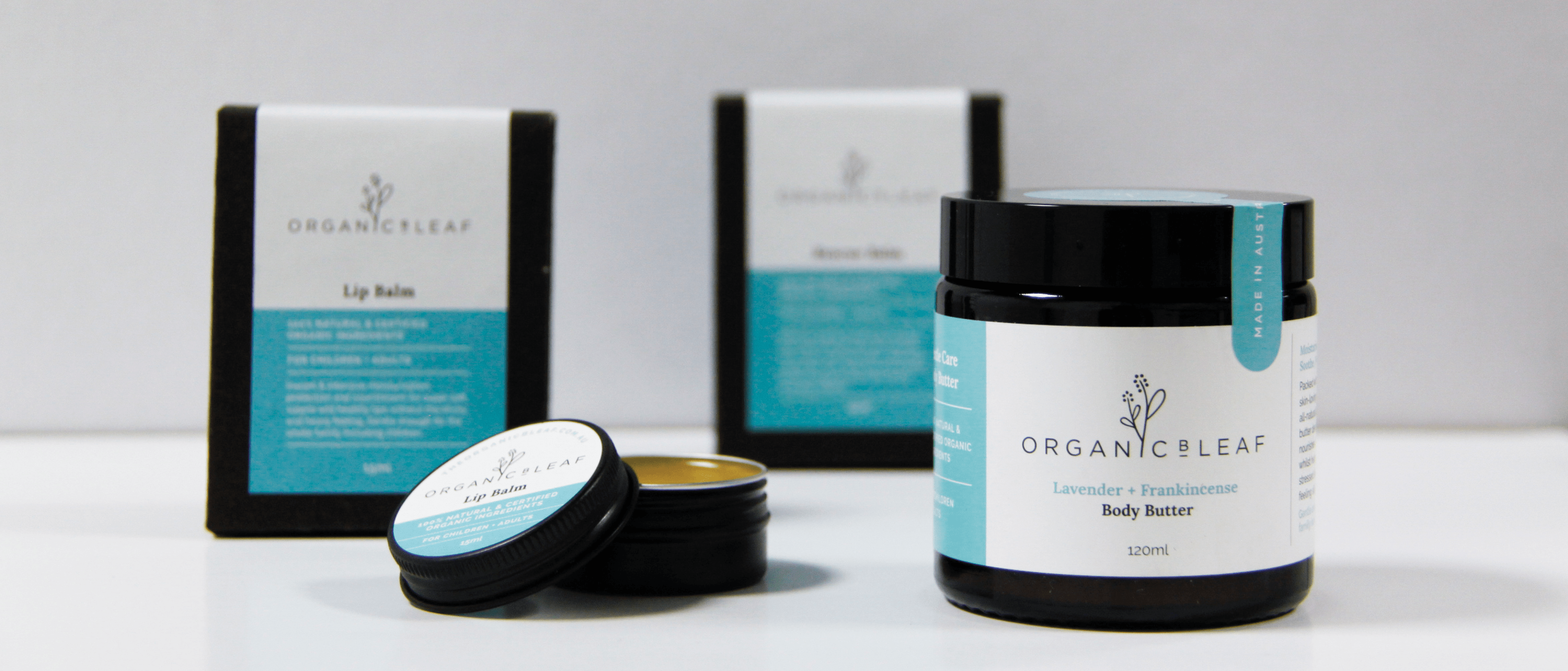
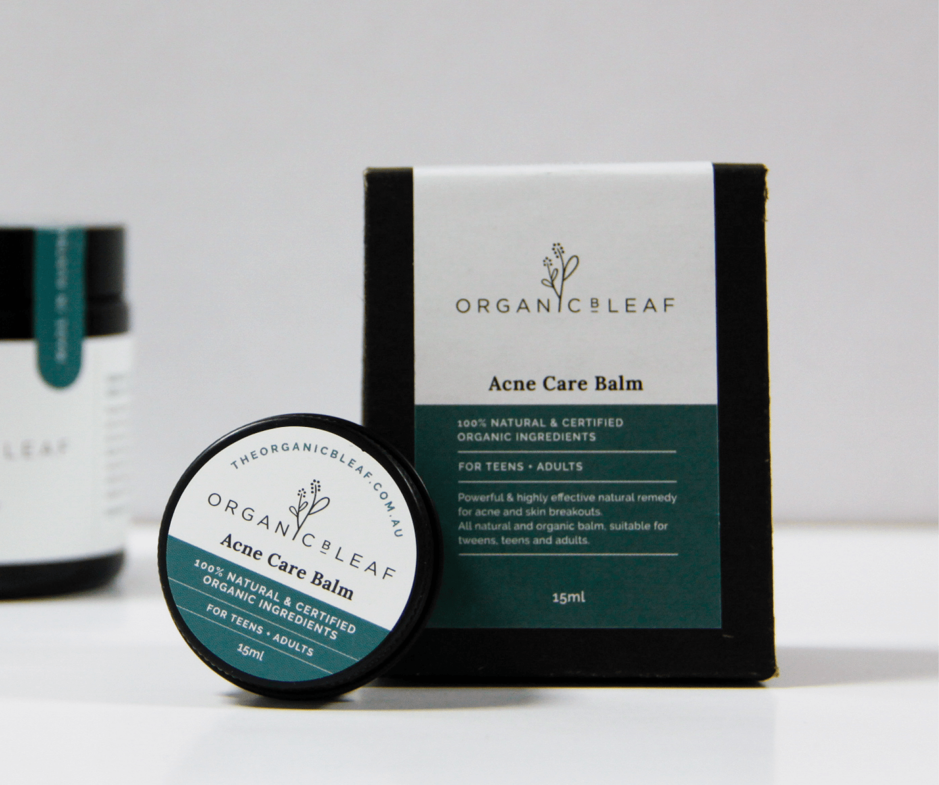
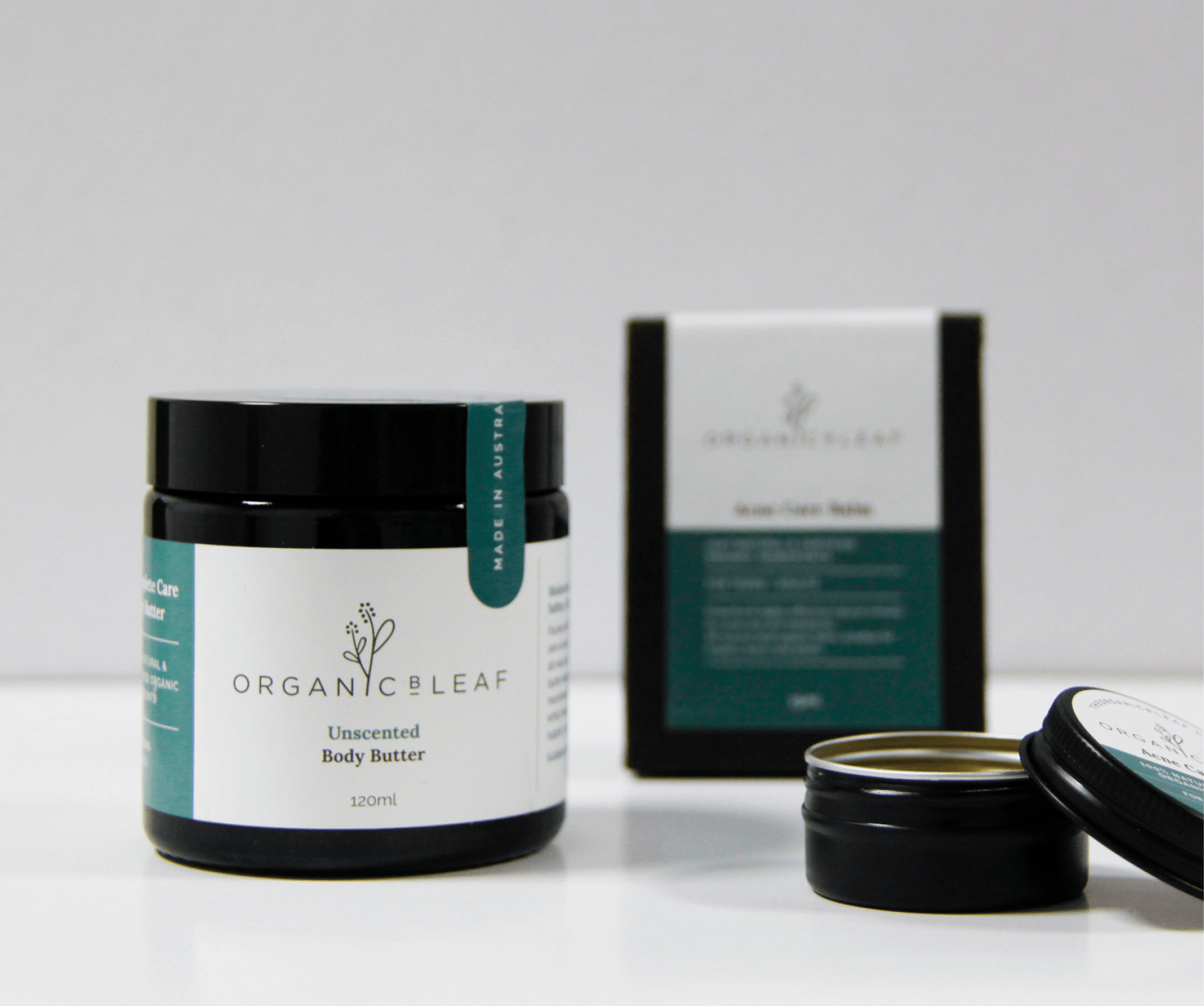
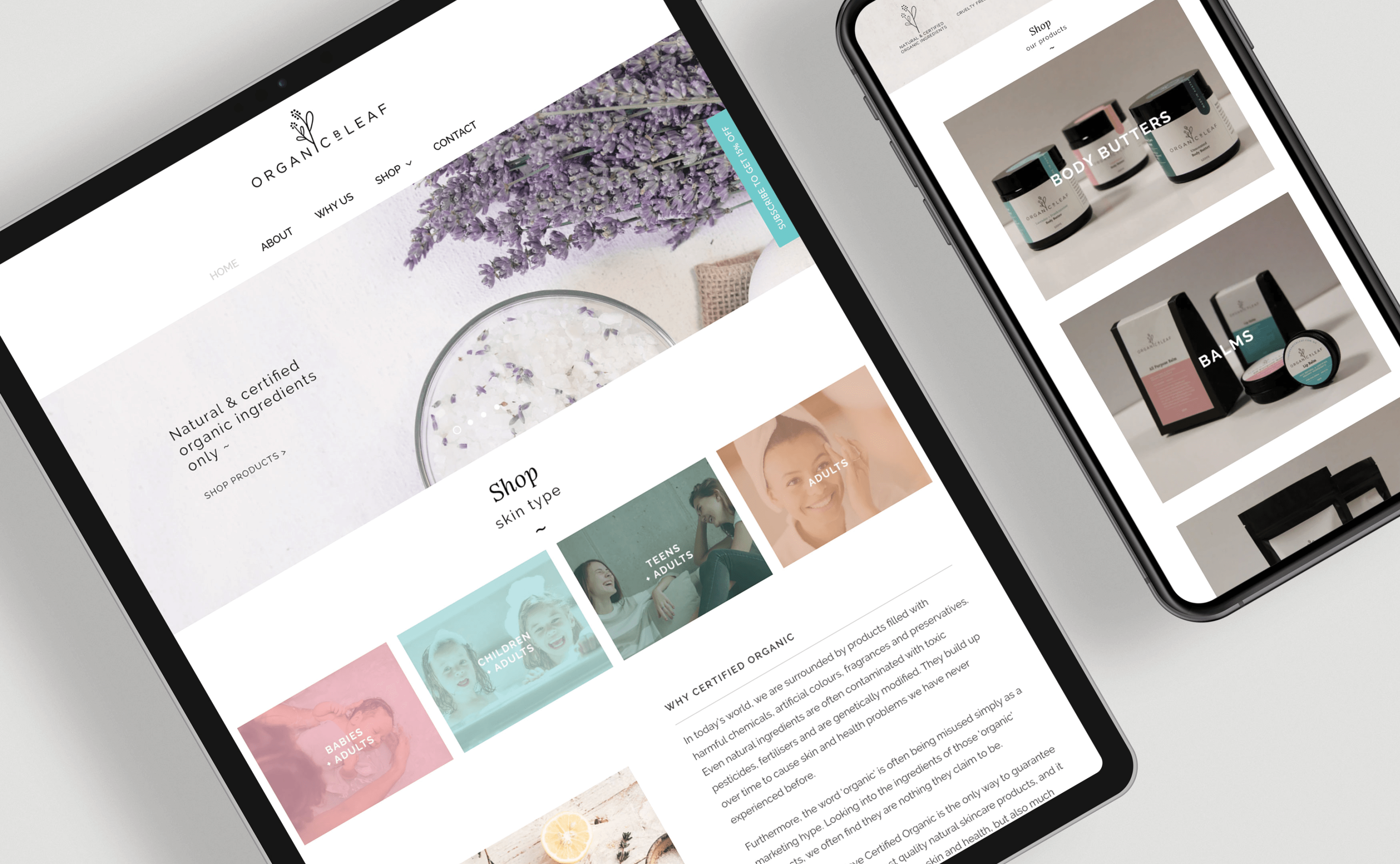
Organic skincare products need bespoke, well-thought-out packaging that is eye-catching and memorable in today’s beauty market. Our design for The Organic B-Leaf has done just that. A need for a complete brand re-fresh with new and improved style meant refining their logo with simple hand-drawn illustration and polished typography. The brand is positioned on being family-friendly and all-natural, so we looked to nature for both inspiration and direction. For their range of bespoke certified organic body butters, washes and scrubs, we developed sleek black jars and pouches with a strong point of difference. Their lip balm tins fitted within natural earthboard satchels radiates elegance, creating a well-crafted and well-considered sense of luxury that is vital to the enhancement of their brand.
LocationSydney, NSWScopeRe-brand, logo design, packaging design, illustrationYear2019
